BRANDING
This branding portfolio showcases a range of identity work created for brands and companies, from full brand systems to individual design assets. The projects include logo design, posters, brand guidelines, vision and mission development, and complete brand packages, demonstrating a considered approach to building clear, cohesive, and adaptable brand identities.
DESIGNING BRANDS WITH PURPOSE


A Brand Identity Built by the Attraction Industry for the Attraction Industry
I was commissioned by Alton Towers Resort and the University of Staffordshire to lead a full rebrand of the Visitor Attraction and Resort Management (VARM) degree, aligning the course with the University of Staffordshire’s wider brand refresh. The project involved designing a new logo, defining refreshed mission and values, and developing a cohesive brand identity system. The rebrand was extended across digital platforms, including the creation of a dedicated Instagram presence, delivering a modern and distinctive identity that reflects both the course’s industry relevance and academic positioning.
The rollercoaster symbol reflects our partnership with Alton Towers and embodies the passion our students have for the theme park industry, representing the excitement and dynamic experiences they aspire to create.

THE LOGO MARK

The University of Staffordshire symbol reflects a significant step forward in the University’s ongoing journey, showcasing its deep connection to the county of Staffordshire and its commitment to fostering positive opportunities for students, staff, and communities globally.


Brand identity built for purpose, faith, and community.
Every Life is a brand centered on transformation through God’s love and power. Its mission is to bring practical hope to individuals, families, and communities by equipping and releasing people to create lasting change. The brand’s visual identity reflects growth, care, and renewal, using simple, meaningful imagery and soft typography to create a warm, welcoming, and hopeful feel.


A Brand Identity Built from Shadows and Story
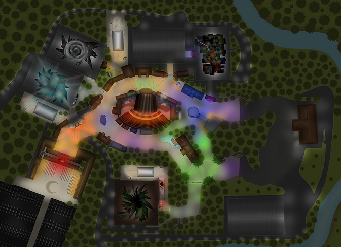
Luna Vale is a dark, story-led brand built around atmosphere, mystery, and unease. The identity draws from moonlit folklore, abandoned spaces, and distorted nostalgia, blending elegant typography with unsettling visual cues. Rich reds, deep shadows, and subtle graphic textures create a sense of something once familiar, now corrupted. Every element of the brand is designed to support narrative-driven environments, allowing the visuals to feel grounded, cinematic, and intentionally unsettling rather than exaggerated. Luna Vale exists to feel discovered, not explained, a brand that lingers long after you’ve stepped away.


Luna Vale is a fully immersive entertainment destination built around dark storytelling and high-quality themed environments. The experience combines multiple scare mazes, atmospheric zones, live shows, and carefully integrated food, retail, and merchandise offerings, creating a complete guest journey rather than a single attraction. Every element is designed to work together — from narrative and architecture to lighting, sound, and branding, encouraging longer dwell time, repeat visitation, and strong merchandise engagement. Luna Vale is scalable, adaptable, and designed to operate as a premium, story-driven destination with broad commercial potential.
WHAT IS LUNAVALE?


A Brand Identity Built for Immersive Environments
Mythantica is a brand inspired by the breathtaking beauty of the Northern Lights. Its identity captures the flowing, ethereal movement of the aurora, translating the vibrant colors, luminous gradients, and dreamlike energy into every aspect of the brand. From visuals to products, Mythantica evokes a sense of wonder, serenity, and magic, allowing audiences to experience the awe-inspiring feeling of the aurora no matter where they are. The brand celebrates fluidity, light, and color, creating an enchanting atmosphere that feels both natural and otherworldly.